

Understand Presentation Options in Use Case Diagram
A UML use case diagram is the primary form of system/software requirements for a new software program underdeveloped. Use cases specify the expected behavior (what), and not the exact method of making it happen (how). Visual Paradigm‘s Use Case Diagram offers a variety of presentation options that allow users to customize the view of their diagrams. Below are all presentation options available to use case diagrams and what are their meaning.
| Options | Available Setting | Meaning | Example |
| Show Diagram Frame | To display the diagram frame header at top left of the diagram. | 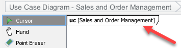 |
|
| Use Case Display Options | |||
| Caption aligned Center | To show use cases in ellipse shape with caption show at the center. | 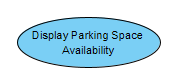 |
|
| Caption aligned Bottom | To show use cases in ellipse shape with caption show below the use case. |  |
|
| Box Shape | To show the use case as box shape with use case icon at top right. | 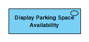 |
|
| Show Extension Point | To show the use case’s extension point on diagram. | 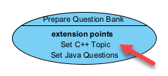 |
|
| Show ID | To show the ID of the use case on diagram. | 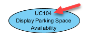 |
|
| Show Status | To show the status property of the use case on diagram. | 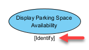 |
|
| Actors Display Options | |||
| Stick Man | To show the actors as a stick man. |  |
|
| Box Shape with Keyword | To show the actors in box shape with <<actor>> keyword. |  |
|
| Box Shape with Icon | To show the actors in box shape with stick man icon at top right. |  |
|
| Extend Display Options | |||
| Show Condition | To show the extend condition on diagram. | 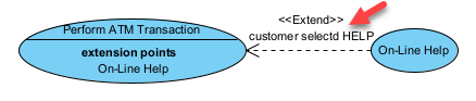 |
|
| Package Display Options | |||
| Within Package Body | Display package name within package body. | 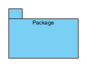 |
|
| Within Package Tab | Display package name in package tab. | 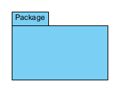 |
|
| Information Item Display Options | |||
| Icon | Display Information Item with icon. | ||
| Keyword | Display Information Item using keyword. | ||
| Background Color… | To set the background color of the diagram. | ||
| Grid | |||
| Grid Visible | To show/hide the grid on diagram. | ||
| Snap to Grid | Turn on/off shape snap to grid behaviour. | ||
| Grid Color | To specify the grid color. | ||
| Grid Setting | To configure multiple grid setting at once. | ||
| Auto Expand Borders | |||
| None | Do not auto expend the borders of the parent element when move a child element towards its edges. | ||
| Right | To auto expend the right border of parent element when move a child element towards its right edge. | 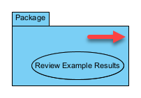 |
|
| Bottom | To auto expend the right border of parent element when move a child element towards its bottom edge. | 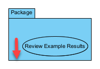 |
|
| Right and Bottom | To auto extend the right border of parent element when move a child element towards its right or bottom edge. | 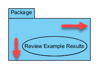 |
|
| Show Shape Legend | To display the shape legend on diagram. | 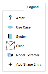 |
|
| Show Connector Legend | To display the connector legend on diagram. | 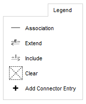 |
|
| Show Color Legend | To display the color legend on diagram. | 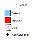 |
|
| Show Package Header | To show the package header at the top left of the diagram. | 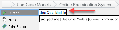 |
|
| Show Stereotype | To show the stereotypes on diagram. | 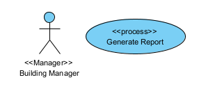 |
|
| Show Tagged Values | |||
| Show All | To show all element’s tagged values on diagram. | 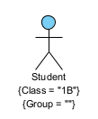 |
|
| Show Non-Empty | Only show element’s non-empty tagged values on diagram. | 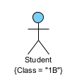 |
|
| Hide All | Hide all element’s tagged values on diagram. | ||
| Show Project Management | |||
| Iteration | To show iteration project management property on element. | 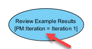 |
|
| Phrase | To show phrase project management property on element. | 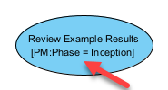 |
|
| Discipline | To show discipline project management property on element. | 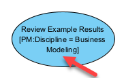 |
|
| Version | To show version project management property on element. |  |
|
| Priority | To show priority project management property on element. |  |
|
| Status | To show status project management property on element. |  |
|
| Difficulty | To show difficulty project management property on element. | 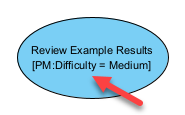 |
|
| Author | To show author project management property on element. | 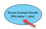 |
|
| Show Relationship Constraint Expression | To display the relationship’s constraint expression on diagram. | 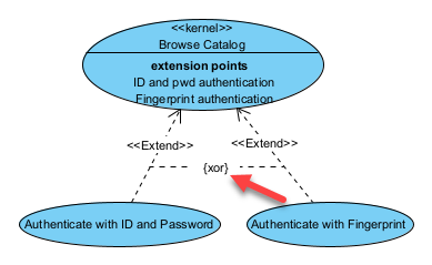 |
|
| Show Constraints | To show element’s constraints on diagram. | 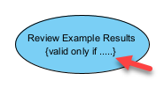 |
|
| Always Show Model Element Indicators | To show model element’s indicator (master & auxiliary view, reference, sub-diagram, model transitor & description) on diagram. | 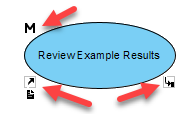 |
|
| Connector Caption Placement | |||
| Top Left | To display the caption at the top left of the connector. | ||
| Top Center | To display the caption at the top center of the connector. | ||
| Top Right | To display the caption at the top right of the connector. | ||
| Middle Left | To display the caption at the middle left of the connector. | ||
| Middle Center | To display the caption at the middle center of the connector. | ||
| Middle Right | To display the caption at the middle right of the connector. | ||
| Bottom Left | To display the caption at the bottom left of the connector. | ||
| Bottom Center | To display the caption at the bottom center of the connector. | ||
| Bottom Right | To display the caption at the bottom right of the connector. | ||
| Caption Placement | |||
| Top Left | To display the caption at the top left of the element. |  |
|
| Top Center | To display the caption at the top center of the element. | 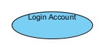 |
|
| Top Right | To display the caption at the top right of the element. | 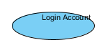 |
|
| Middle Left | To display the caption at the middle left of the element. | 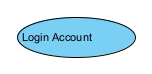 |
|
| Middle Center | To display the caption at the middle center of the element. | 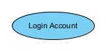 |
|
| Middle Right | To display the caption at the middle right of the element. | 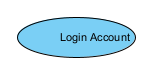 |
|
| Bottom Left | To display the caption at the bottom left of the element. | 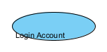 |
|
| Bottom Center | To display the caption at the bottom center of the element. |  |
|
| Bottom Right | To display the caption at the bottom right of the element. |  |
|
| Shape Presentation Option | |||
| Standard | Show element with default notation. | 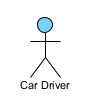 |
|
| Stereotype Icon | Show element according to its stereotype’s icon. | 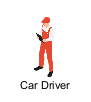 |
|
| Show Name of Stereotype Icon | To display the name of stereotype icon on element. | 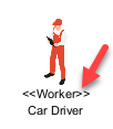 |
|
| Highlight Glossary Terms | To highlight glossary terms on matched elements. | 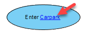 |
Related Know-how |
Related Link |
Leave a Reply
Want to join the discussion?Feel free to contribute!